FinTech · B2C
A home dashboard for investors
Redesign of the home dashboard in the investor's account of an international crowdfunding platform.
Role
Senior Product Designer
Research
Heuristic review, analytics, support feedback
Scope
Main Dashboard
Year
2023 — 2025
About
Familiar flows, fixed where they hurt
A long-standing international platform for crowdfunding and referral investments. Because of its age and its users' habits, the redesign had to keep familiar flows while solving the usability issues research found.
My task: a new Main Dashboard for the investor's account.
Problem
Several sections to find one number
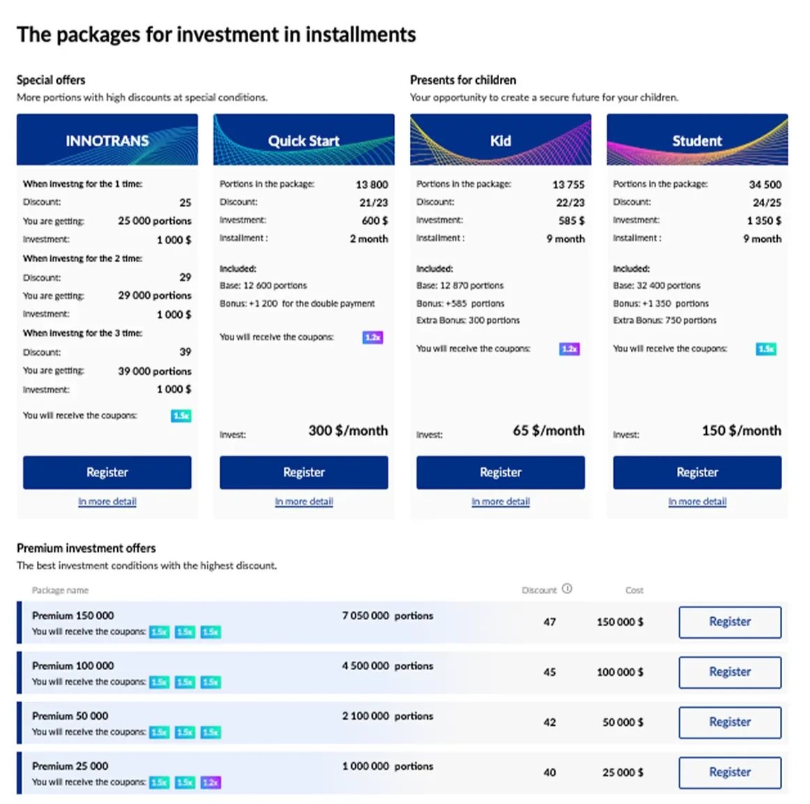
Investors had to go through several sections to see their statistics and promotions. The interface was outdated, with a complicated hierarchy and a cluttered structure, while key business metrics had to stay visible.
A heuristic evaluation, user behaviour and support feedback pointed at the same complaints: main financial stats hard to reach, long flows to promotions and coupons, an overwhelming home page.
Solution
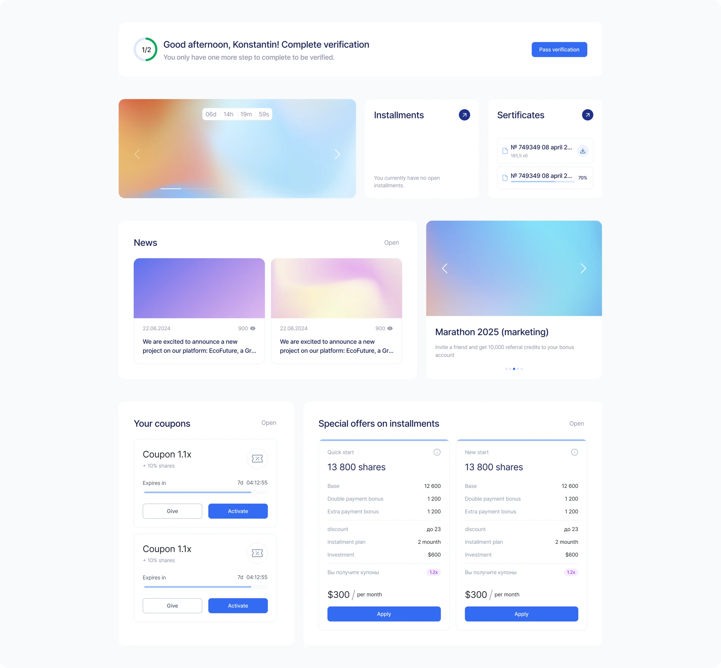
A new Main Dashboard: key metrics, account status and active promotions on one screen
Solution
One screen for metrics, status and promotions
Promotions and installment plans up front, one clear example block instead of a cluttered set of packages and coupons, and a simple verification block.
Time to find key information down 65%
According to Yandex.Metrica and post-launch user testing. Click-through to Promotions and Installment Plans went up 39%, and bounce rate went down.
−65%
Time to find key information
+39%
Click-through to key sections